Statistical modelling /Milk curve comparisonsBy fitting linear regressions in GenStat by Stats → Regression Analysis → Linear Models… and clicking the 'Options…' button, followed by the 'Plot Fitted Model', the graphs below can be produced. The lengths of the x- and y- axes have been made the same for each graph to allow direct comparisons between them. This is important - otherwise the different scales determined by the different ranges in data values can often give a false impression 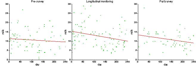
|
![]()
![]()
![]()